


The Design of a Window
It’s amazing how much thought ends up going into user interface design. It can be quite a process. A never-ending cycle of experimenting and refining.
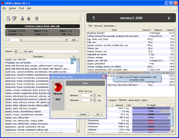
As mentioned below, I expect many CRON-o-Meters to dislike the major change I made to the main window. What I did was to remove the entire left-side food search panel, and place it in a pop-up dialog box. I expect users to initially dislike this change because it feels like something was taken away. Many people fear change, and initially I was quite against this idea myself. I have a natural tendency to favor embedded reactive interface elements over pop-up modal dialogs.
I spent a lot of time thinking about this design choice, and playing with various different implementations. The initial decision was one of consistency and metaphor. A good user interface has to be consistent. It is also good if there is an underlying metaphor to the design. When we can link the abstract concepts in a program into something more physical, our minds operate more naturally. Witness the success of the original Macintosh, which relied on the metaphors of a desktop, file folders, waste baskets, and so on.
In the older CRON-o-Meter, the placement of the food search panel was inconsistent at times. For instance, if you are editing your biomarkers, it doesn’t make sense to be searching for foods — and in fact you can blindly add foods to your day’s list. I wanted to focus the program more on the metaphor of showing the single day. There’s a boldly visible date at the top, and everything else beneath should apply to the day in question. By taking the panel and making it a pop-up from within the servings list, it makes more sense.
While bouncing these issues back and forth with Gerald, a new volunteer with the project, Gerald had an excellent idea for the future versions to use a unified metaphor for both foods, biomarkers, and exercise. I’m excited about that next step — its going to be really cool. The new organization will make a lot more sense.
The second issue in good UI design is to streamline the things a user does most frequently. By far, the most common thing a user in CRON-o-Meter does is search for foods and choose amounts to add to their log. At first glance, it feels like the pop-up dialog adds an extra step in this process — you have to click a button to show the dialog. However, if you count the steps between the old version and the new version, the new version requires less user-input.
In the old version, you have to click the mouse into the search field. If the search field contains text from a previous search, you have to select and delete the old text, then type in the new search term. Then you have to select a food from the list, then choose a serving and add it.
In the new version you either have to click the “Add Serving” button (or type the keyboard short-cut). This brings up the dialog with the keyboard focus already in the search box, ready to type, so it actually saves a step over the old version.
There are also many ways to accelerate through data entry with the keyboard. If you used the keyboard short-cut, then you don’t even have to move your hand to the mouse. If the top ranked search result is what you’re looking for, hitting tab twice will auto-select it. When you select a food, the keyboard focus automatically transfers to the amount field. Hitting enter after typing an amount will automatically add the food. Tab will select the Measure menu and you can use the arrow keys to page through them. You can actually enter foods without ever touching the mouse.
A third important aspect is Simplicity, without compromising the power of the application, and without harming the first two considerations. Moving the search panel simplifies and clarifies the main window. It presents less to a new user and helps focus them on their task.
I certainly can’t claim to be a great UI designer. It’s a hard (but fun) process for me. I feel I’m always getting better, but there’s so much room for improvement. I do try to put a lot of though into it all. To me, it’s a matter of craftmanship. I’m interested to hear if y’all agree with my overall analysis here. Especially those with discriminating tastes towards user interface design (you know who you are!).


Aaron,
As I have said before, CRON-o-meter is a very useful tool that will make you more notable and more appreciated (although not necessarily richer) than you ever could be by writing poker game programs. Isn’t Optimal Nutrition a great game? There are so many variables and so many unknowns, and there may be a fantastic payoff in health and well-being!
The new 0.7 paradigm focusing on each day is very good. Here are a couple of thoughts for future development:
1) Multiple users 2) Nutrient search.
1) Multiple users: I don’t know how MR and April use CRON-o-meter in one household. Do they have different PCs to track their nutrients? CRON-o-meter does not support multiple users right now because there is only one “user.settings” file. By adding a “Name” field in the “Body Profile”, the user name could be associated with individual profiles for settings. There could be files “MR.settings”, and “april.settings”, or whatever. Alternately, the user names could be mapped to “user.settings”, “user1.settings”, etc. The other change would be to ask the user at start-up to select a profile, and there should be a mechanism for switching profiles. Recipes and foods could be common for all users.
2) Nutrient Search: This is a typical user’s quandary: “Today’s diet shows only 37% of Vitamin K. What can I eat to satisfy this deficiency?” The solution is to modify the database search so that there is a second drop-down menu that specifies all the nutrients. The default of this drop-down menu should be “Description”. In this way, typical searches (current searches) would be interpreted as:
SEARCH DATABASE=(USDA) FIELD=(DESCRIPTION) VALUE=(carrots)
However, it would also be possible to conduct a search for Vitamin K, or methionine, or selenium, etc. Selecting “All” databases from the DB drop-down menu, and “Vitamin K” from the second drop-down menu would result in the following search request:
SEARCH DATABASE=(ALL) FIELD=(Vitamin K) VALUE=()
Selecting something other than “Description” from the second drop-down menu would launch an immediate search without requiring data input in the search box. The results would be ordered in decreasing nutrient density, and could be re-sorted by clicking on the % column heading.
Thanks,
Tony Zamora
how do I down load the new cron-o-meter?
Sheila: click on the bright red apple.
Exercise module?
Hi Aaron,
How do you envision the exercise portion of cron-o-meter? I hope there is an option to track running/walking mileage.
Enjoying using it.
Al